Working with you the whole way...
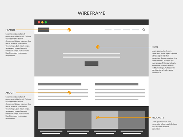
From idea to research, wireframe to design, build to launch, I'll guide you along the way with tips on best practices, usability and important considerations for accessibility.
This section is restricted to clients only. Please enter your username and password to enter.
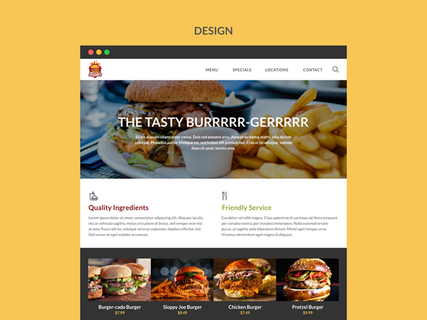
From idea to research, wireframe to design, build to launch, I'll guide you along the way with tips on best practices, usability and important considerations for accessibility.